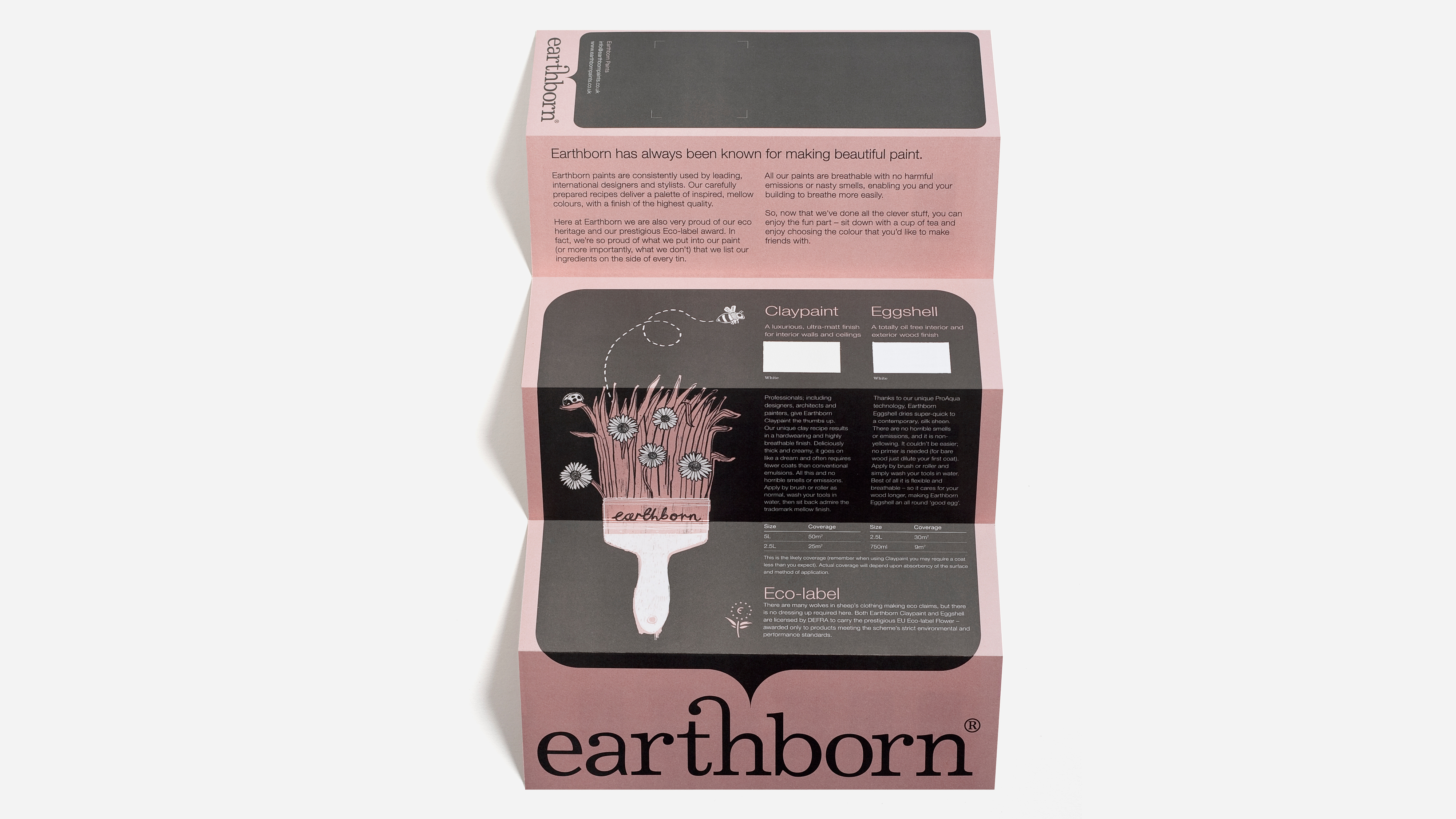
Earthborn
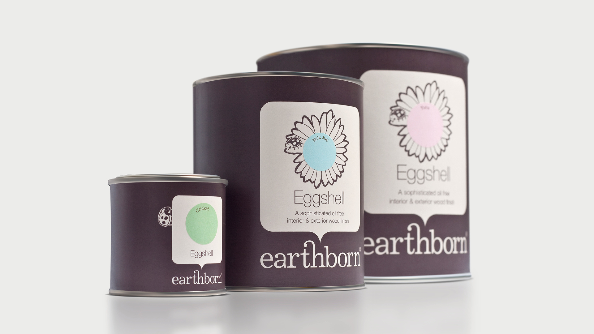
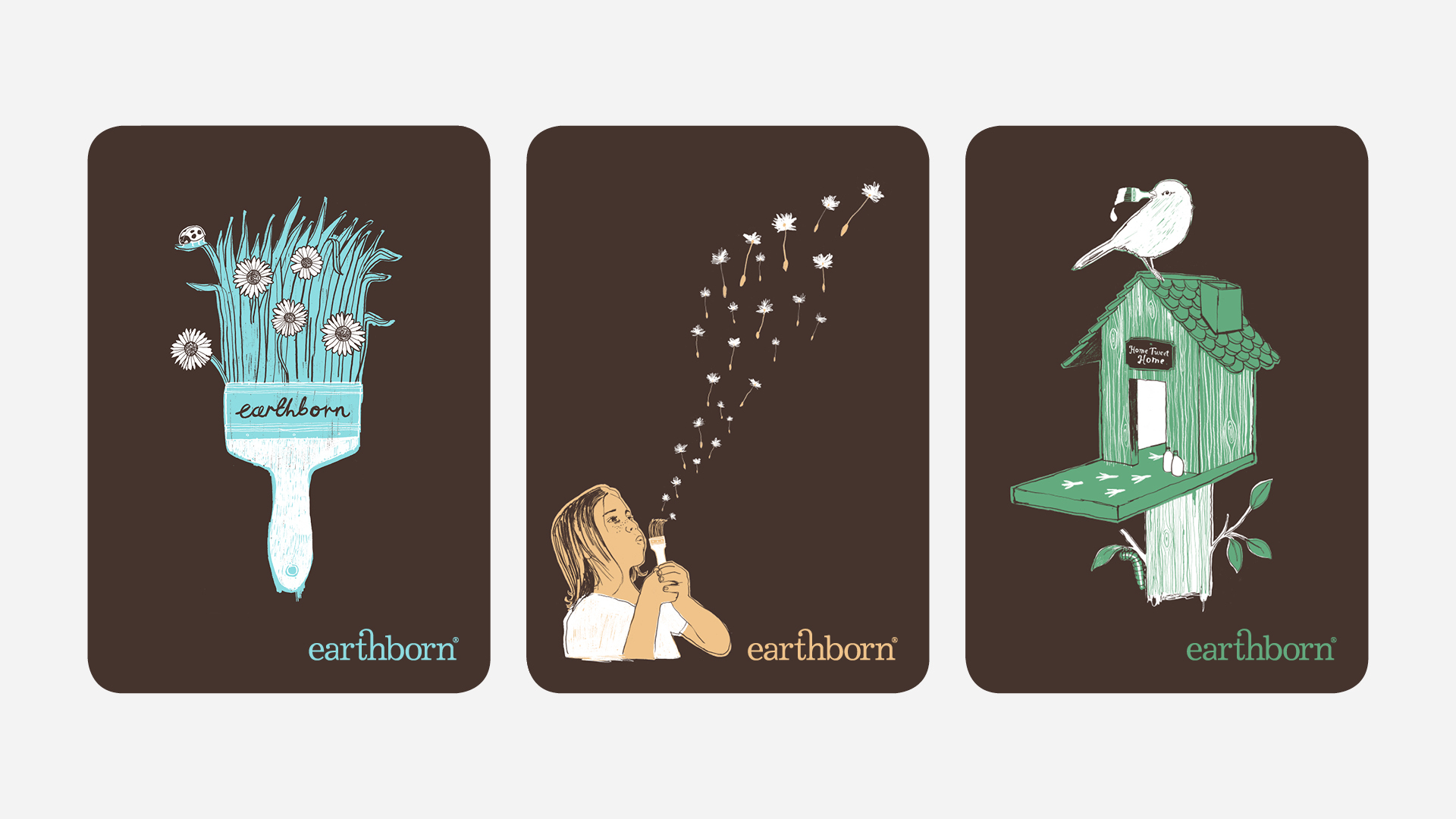
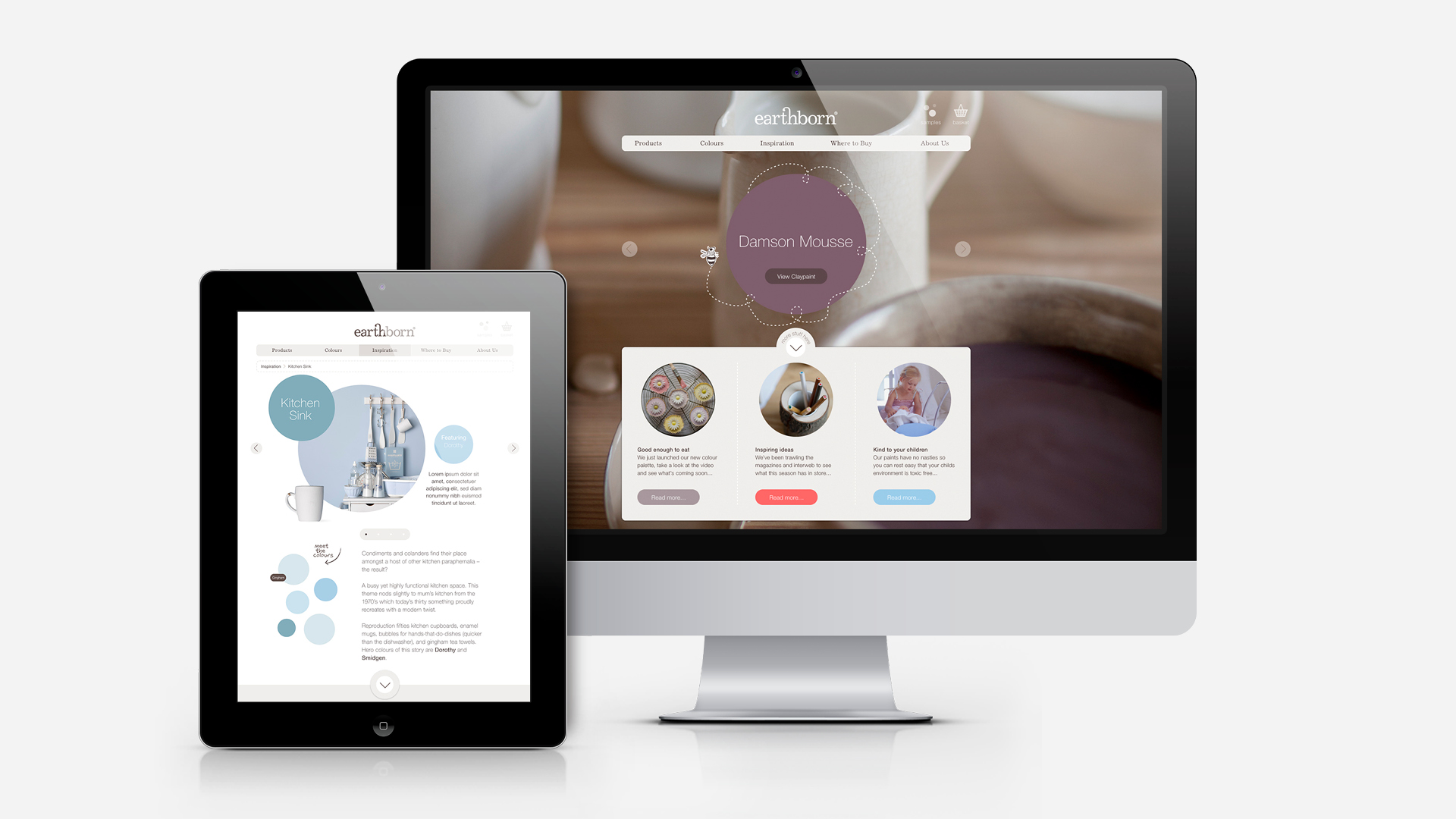
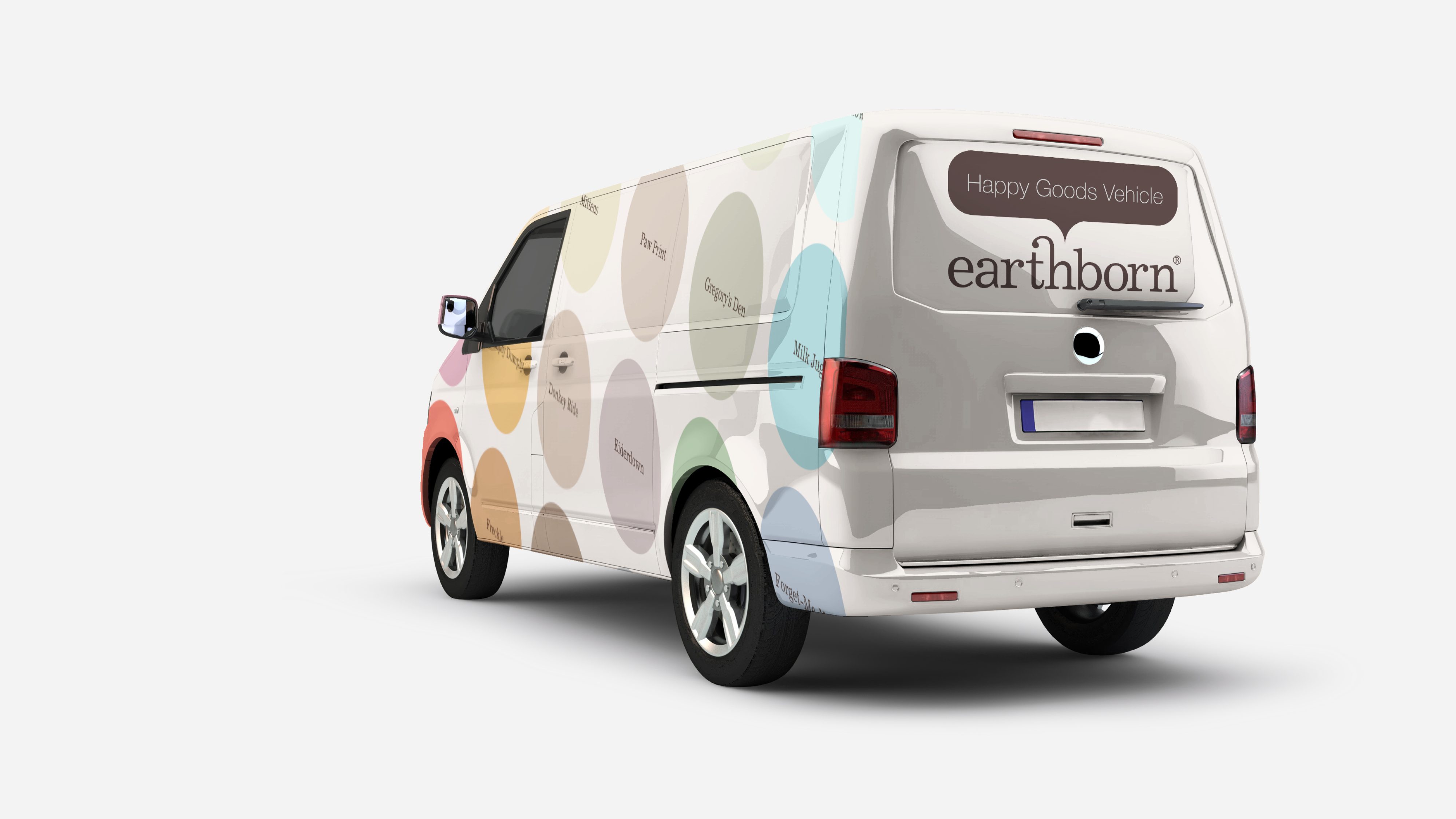
Initially approached to refresh the existing branding, we seized the opportunity to project a more colourful personality. We crafted a new brand identity incorporating quirky illustrations, a friendlier tone-of-voice and a more considered approach to colour naming. Initially rolled out across packaging, colour cards, pos and trade advertising, the new branding was warmly received by stockists. A new website was then developed to serve both trade and consumer audiences. The website provides product information, interior design inspiration and enables sample pots to be purchased online.

Result
Colour card requests sharply increased and even better than that, sample pot sales rose by 50% in the first month alone. Stockist enquiries increased by a dramatic 300%. Data sheet requests also slowed indicating that users are finding the information they need online.